


pukko
-
Posts
247 -
Joined
-
Last visited
-
Days Won
12
Content Type
Profiles
News and Information
Tutorials
Product Reviews
Supplier Listings
Articles
Guitar Of The Month
Links and Resources
Forums
Gallery
Downloads
Posts posted by pukko
-
-
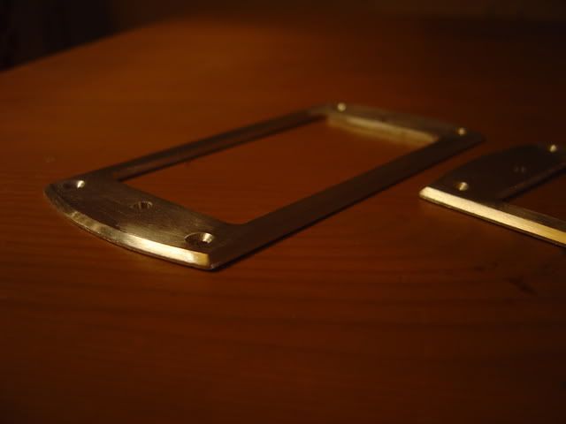
Since I'm just waiting for the lacquer to dry completely, I tried making some pickup rings from aluminium. They obviously need much more sanding and polishing before I send them to the guy that chromeplates them, but you get the basic idea. I'm thinking about some small changes to the shape to make them a little more personal, but I haven't decided what to do yet.
-
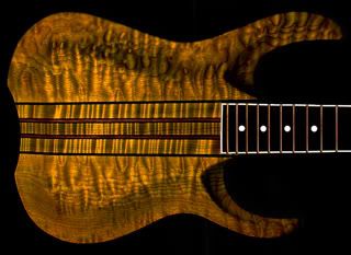
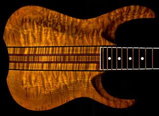
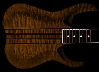
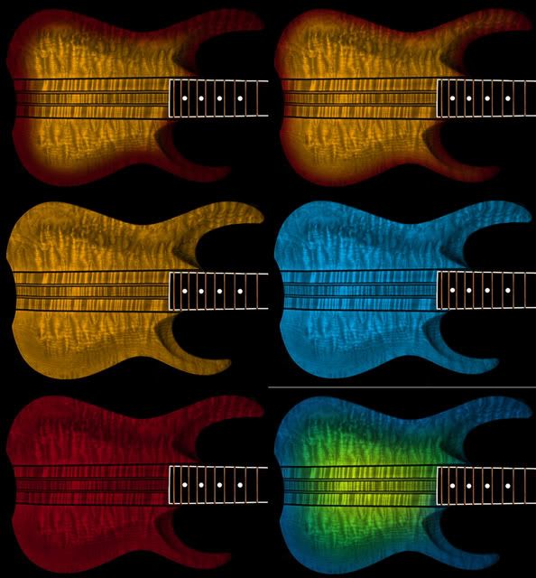
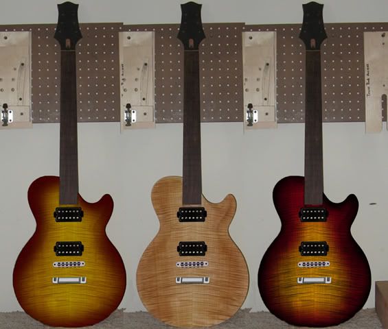
Ok, two versions of amber/brown:
-
Here's a brown version, were you thinking lighter or darker, westhemann?
-
The last one looks like an alien.
Well, I don't think it's that pretty either... I just saw some pictures of a guitar with a "carriburst" and tried to do one of those. Not the most subtle of finishes...
-
I tried some cherry sunbursts of different edge thicknesses, and some other colours just for fun.
-
First of all, thanks to everyone who voted for my guitar and for all the nice comments.
IPA or death, the logo on the headstock says Luciferi, so that would be the "brand" name I guess. My next build has the same name. No name for the particular model though, I never thought that far really...
I didn't vote at all. Of course I like my own guitar, otherwise I wouldn't have put it in the competition at all. It just seems to me that it's up to everyone else to judge it, it's your comments I want. I already know what I think. After all, this is mostly a beauty contest really since most people have no idea how these instruments sound or feel. It's just the visual aspects that get judged. I haven't seen any beauty contests where the girls get to vote, so I figured I might as well not either...
EDIT: What the h***, when I posted this reply it says that I have voted! I hadn't when I started writing, why did that happen? Is there any way to remove my vote? I don't even know which one I voted for...
-
Always a tough choice, but this month is the hardest for me. I went with Pukko, not because it would be a guitar that I would buy, but because the design, the parts and the look all went together so well.
Thanks!
-
Another observation: For some reason I don't think the problem is as noticeable when you see the guitar in playing position. I flipped the photo 90 degrees:
-
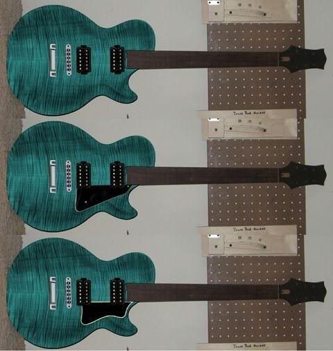
OK, here we go: one without pickguard, one with a LP-style and one with a modified Heritage pickguard. The Heritage version could cover more of the problem area, might be something to consider.
-
That's a really nice guitar you're building! I did a mockup to see what it would look like with pickups. I don't know what finish you're going for, but one thing that would hide your problem a bit would be to burst it. Here's a couple of alternatives:
Let me know if you want me to try other colours, I'll try to fix that.
-
Pukko - wow... the attention to detail is fantastic its a really nice design and all the small details really set it off. again to agree with Godin i would have prefered a matching neck to the body and that would have made it perfect!
Thanks! I'll do the next one (if there ever will be...) with a mahogany neck!
Lord-of-the-strings Posted Nov 23 2006, 03:14 AMPukko's does it for me
Thank you!
Hydrogeoman Posted Nov 23 2006, 07:12 AMRight now though, I think I am feeling the love for Pukko's. Very cool and tastefully done my man.
Thanks to you too!
CrazyManAndy Posted Today, 04:34 AMBut I am in love with Pukko's guitar. It is just beautiful. It really captures that look I love; the combination of a tried and true "player's" guitar with the really pretty, detailed ones that you see on PG that look like they ought to be in a display case. I could see myself rocking out with it (*hint* *hint* ).
How does it sound anyway? I've heard a lot of people don't really like the dream 90's, but I am curious what you think.
Thanks a lot! Well, I guess it sounds kind of like what I expected, very fat singlecoil tones. It's a little brighter than I thought it would be, I guess it's the maple speaking... I forgot to write about the wiring in the GOTM thread and that one is locked now, so I'll do it here:
Neck and bridge pickups have one volume control each and a tone control that works on all pickup selections. A Les Paul-style three-way switch and a push-pull switch on one of the volumes give these options:
With the push-pull down, the three-way switch works like on a Les Paul (neck, neck/bridge, bridge pickup). When the push-pull is up, the middle pickup is added to whatever pickup combination is selected, giving neck/middle, neck/middle/bridge and middle/bridge combinations too.
I haven't tried the Dream 90's in any other guitar, and I haven't tried any other pickups in this guitar, so it's hard to compare with anything else. I like them in this guitar, though I've been toying with the idea of putting a Dream 180 in the bridge position for heavier distorted tones.
-
I also have to say that the other contestants instruments really impresses me, all of them look great! I just wish I could find all those nicely figured woods here in Sweden...
-
I don't really like any of them...
NOT hahaha
Pukko, you ROCK. That guitar is awesome. The finish looks well done, all the little details (jack plate anybody?
 ) look well done. The design just works so well. The 1 thing I don't like is the color of the neck as opposed to the body. I would have liked the two pieces of mahogany to be the same color.
Props to ya

Thank you very much! That makes me really happy! I have to clarify one thing though, the neck is made of maple. Both the maple neck and mahogany back is stained with the same colour, I was trying to make the maple look like the neck on my Vintage Reissue Strat. I got pretty close, though it looks too orange in the photo of the back... I didn't think I would be able to stain the two different wood types to the same colour, that would also have looked good.
-
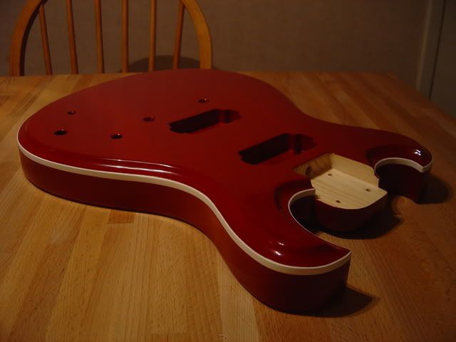
wow, that red looks nice & the binding really sets it off.
Thanks! It contrasts pretty nicely I think.
-
Biltema?
Of course! Biltema, Jula and Clas Ohlson are my best friends...
-
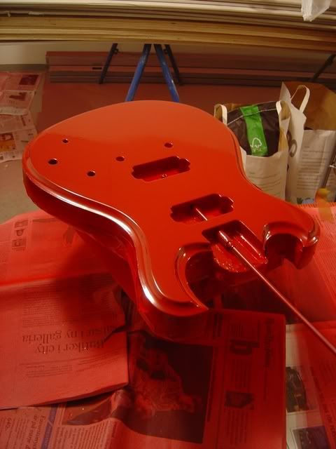
That is ALL done with spray cans? Incredible! And the binding came out so clean, much better than my first pinstriping experience. What was your method to get the paint so well, just patience? How many cans did you end up going through?
Yep, all cans. I'm using cheap car repair spray cans from one of the biggest chain of stores for that stuff in Sweden. This paint is actually not that great, the reason I'm using it is that you can choose between a lot of different shades of colour. I have now been told about a company that fills spray cans with any car colour you want, I'm going to check that out. Higher quality on those, I'm sure.
I sprayed the clearcoat from the same brand of paint as a primer, sanded that even, and then sprayed the red. I figured it was safer to use the same type of paint so there wouldn't be any weird reactions between paint layers. I have sanded the red now and will start clearcoating the whole thing with cellulose laquer spray cans this weekend (I hope...).
I painted it in two steps. First I did the back, so I masked the top and binding and sprayed everything else.
After that, I took the masking off and masked everything but the top. I didn't put any tape on the binding on the top, just on the sides. I figured it would be easier to scrape the binding clean afterwards than to try and mask that thin top edge nicely. It worked fine. I think I used 2 1/2 cans of paint because it doesn't cover too well. If I had used paint that covers better, I might have needed only 1 to 1 1/2 cans.
-
That's freakin ace! Congrats
Thanks!
Ben Posted Today, 04:02 PMQUOTE
Thanks, I'm glad you like it! Why were you disappointed at first? Did you want it to be a different colour? What colour in that case? I really like to hear different opinions on it, I tend to get stuck in one way of thinking, so it helps to hear what others think when they see a design.
I was disappointed cos it looked so good natural, but now I think red was a good idea, it looks great.
I quite like the black too btw, but i prefer red
Yep, I'm glad I chose the red colour now, I think it turned out like I wanted it to.
-
ABSOLUTELY GORGEOUS MATE, HAVE A SLAP ON THE BACK!
Thanks!
Ben Posted Today, 01:34 AMCool!
I was disappointed when I saw you'd painted it flat red, but I've changed my mind now, it looks awesome!
Thanks, I'm glad you like it! Why were you disappointed at first? Did you want it to be a different colour? What colour in that case? I really like to hear different opinions on it, I tend to get stuck in one way of thinking, so it helps to hear what others think when they see a design.
-
And this is what it looks like with the binding visible:
Different angle: http://i107.photobucket.com/albums/m283/pukko2/DSC02124.jpg
-
That looks cool! Caparison headstock? Is the neck/fretboard going to be set that far into the body, how many frets are you going to have?
-
Top painted as well, can't wait to see how it looks with the binding. Tomorrow...
-
Yeah...live in Gothenburg at the moment....
I should have guessed that, now that I see your avatar. Have you seen Ian Persons First Act guitar? Takes a big Blåvittfan to do something like this:

-
I'm looking forward to seeing how your build turns out, and how it fares in the GOTM contest if you enter (why not?).
Thanks, me too! We'll see about that contest... Someone told me to enter with my first build, so I did that. I want to see how that turns out first...
-
they all look nice, black suits the headstock but looks a bit too nu-metal for my liking. I love surf green & daphne blue but I think that it would need a matching headstock to look perfect. The yellow could look nice...so could cream & the silver would be brilliant....but....I actually think that you've gone for the right one with deep red.
The bursts seem a bit too obvious. I'm pleased that you've gone for a solid colour, it suits the style of the guitar more.
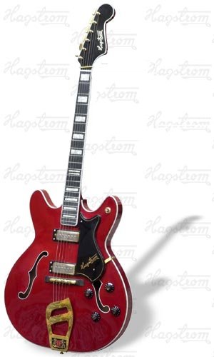
I agree on everything you say except maybe the nu-metal thing. The yellow was meant to be a gold top look, maybe with a red or brown stain to the back. The green and blue does need a matching headstock, you're right again. The reason I did it red with black headstock is a picture of Elvis playing a Hagstrom Viking that had that colour combination (maybe seethrough red though). I'm no big Elvis fan, but the guitar looked great! And it's Swedish. This is the model:
 ) look well done. The design just works so well. The 1 thing I don't like is the color of the neck as opposed to the body. I would have liked the two pieces of mahogany to be the same color.
Build #2
in In Progress and Finished Work
Posted
Thanks! It took a couple of hours, but the aluminium is really easy to work with. I'm making a jackplate with the same shape (except for the hole for the pickup of course) to get a little continuity in the hardware design. Lots of chrome on this one...